
Post


Mark
Silver rank
Wackdonald's Registration Form
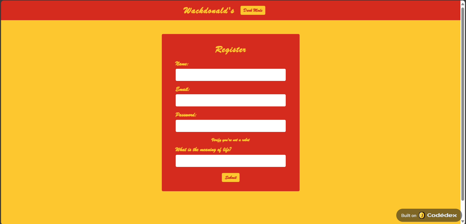
Basically, a registration form for Wackdonald's in Mcdonalds color theme. The UI design/CSS is so bad to the point you need to click it fast multiple times to use the dark mode and input text. Also, when you type something, it hides the thing you're not even typing into lol. What's readability when you have this font lol. The user experience is so down low to the point you'll ask yourself "just why" and also what's the point of security when you can see every information you typed without hiding it with asterisks or something after submitting the form lol. I guess that's all, please visit my one of a kind abomination work.

13 comments
Eric Wynn Romere
Gold rank
I've probably showed a dozen people the dark mode button in person at this point. Even to strangers. 😆

Melissa Wells
Silver rank
This had me wheezing and cackling, very nice! Omg, when I did dark mode it had me like


Community Guidelines
Review our Code of Conduct
© 2025 Niteowl, Inc. · Terms · Privacy Policy