

Miracle Awonuga
Joined 09-07-2022

...

...
Share to:


2
...
...
 Miracle Awonuga
Prerequisites: Python fundamentals, Microsoft Excel
Versions: Python 3.10, Plotly 5.9
Read Time: 45 minutes
So you want to learn about making data visualizations, huh? Well, you’re in the right spot!
Data visualization is translating data into a visual representation to make it easier on the human eye. It makes communicating complex ideas more effective, quick, and easy to follow. It is super important as it makes data more accessible and digestible.
Plotly Express makes it easy to begin learning this process. It is an easy-to-use, high-level module that creates common figures such as line graphs and scatter plots. "High-level" means that it's more generic and therefore limited in functionality, but ideal for beginners. Plotly was actually the first library I used when I started my journey in data!
In this tutorial, we will create data visualizations of popular YouTube channels using Python, Pandas, Plotly Express, and Google Colab. We will use a histogram to look at subscriber counts, a pie chart to compare video categories, and a box plot to find patterns in the years that creators started YouTubing.
Let’s get into it (yuh)!
First, visit colab.research.google.com and start a "New notebook".
After that, make sure you have the latest version of Python on your machine. It would be best if you were running version 3.10 or above.
You can check this by typing python3 --version in the Windows command prompt or the terminal on Mac and Linux, and pressing enter. It should look something like:
$ python3 --version
Python 3.10.5
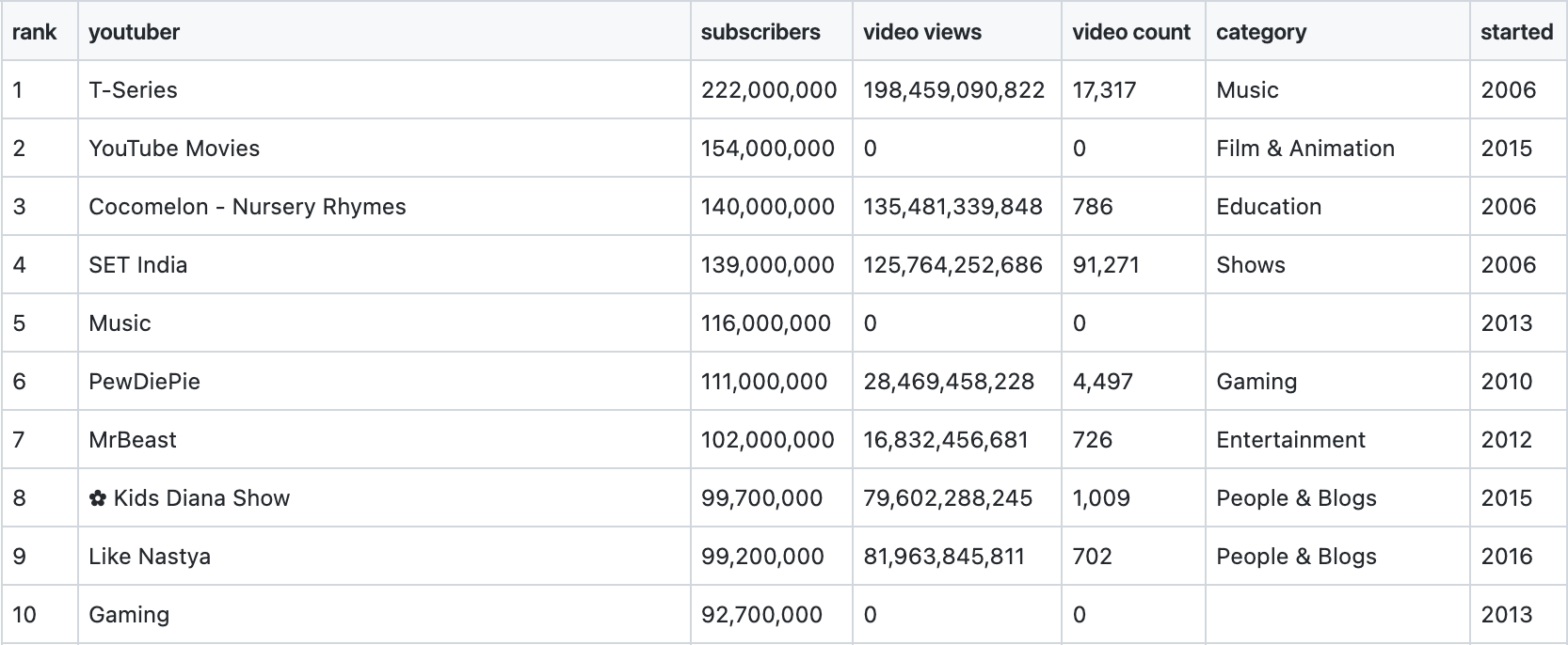
Once you have checked this, pull up the Plotly Express docs page. It will come in handy while working. Finally, download the dataset used for this tutorial from down below. There would not be a data visualization without some data!
For this tutorial, we will use the "Most Subscribed YouTube Channels" dataset from Kaggle. The file is called most_subscribed_youtube_channels.csv. You can download it here.
As the name suggests, it contains data about the top 1000 YouTube channels.
There are seven columns:
rank: Rank of the channel as per total subscribers (1-1000)youtuber: Channel namesubscribers: Total number of followersvideo views: Total views of all the videos combinedvideo count: Number of videos uploadedcategory: Channel genrestarted: The year that the channel startedIt looks something like:
We have made acquaintance with our dataset. Now, let’s jump into some visualizations!
First things first (I’m the realest), we are going to import our data into our notebook. After downloading your dataset, you should return to your handy dandy Google Colab notebook.
Inside the notebook, go ahead and input the following:
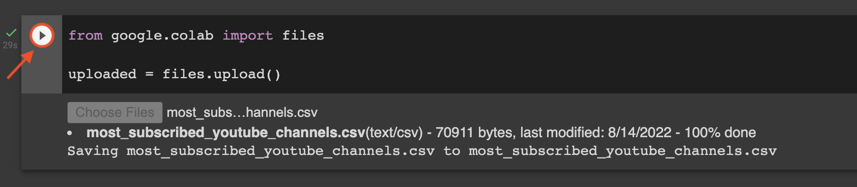
from google.colab import files

uploaded = files.upload()
Press the play button, and there will be a prompt to upload files from your computer. Look in your local drive for the dataset (most_subscribed_youtube_channels.csv) and upload the file.
You should have something like this!
The files.upload() returns a dictionary of the uploaded files. The dictionary's keys are the file names, and the dictionary's values are the file data, based on Google Colab's documentation on how to upload files to Colab.
In our case, we only uploaded one file. And we are storing this dictionary in the variable uploaded, which we will use in a bit!
Pandas is the most widely used open source Python package to perform data analytics. To use it, we will import pandas as pd. pd serves as the alias (nickname) for referring to the Pandas package in our program.
After importing Pandas, we will need to import io. Doing this will let us import our data into a DataFrame and work with file-related input/output operations:
import pandas as pd
import io
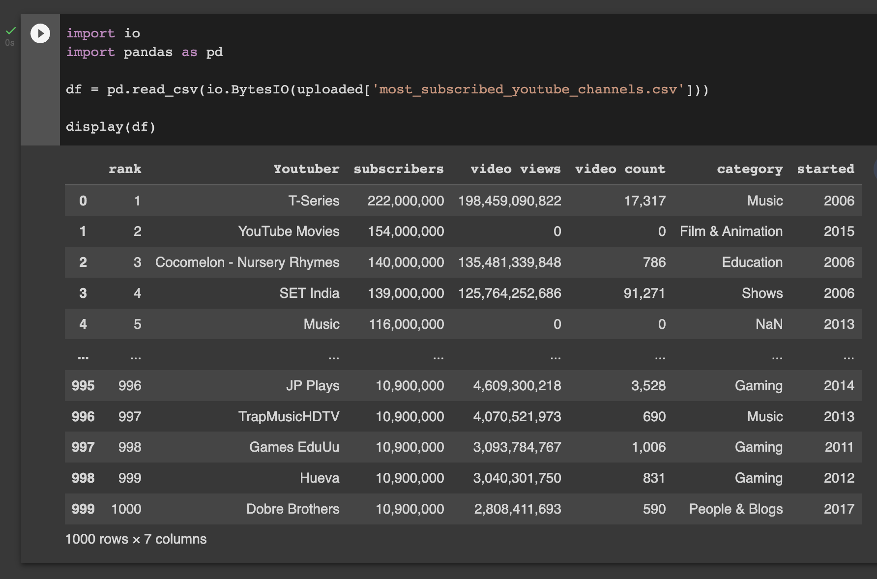
Once you have done that, we need to create a Pandas DataFrame. A Pandas DataFrame stores data as a 2-dimensional table in Python. As analysts, we want to be quick in generating graphs, so we can take our time analyzing and reporting our findings. And DataFrames are a great way to structure our data; they are fast, easy to use, and integral to the Python data science ecosystem. You can use any shorthand name for the DataFrame variable, but for this example, we will use df.
The df variable will store the DataFrame returned from the pd.read_csv() method. To do that, you would put in pd.read_csv(io.BytesIO(uploaded[file_name.csv])). This line reads our CSV (comma-separated value) file and returns it as a DataFrame.
And lastly, use the display() function to show the df DataFrame.
You should have the following after completing the steps above:
import pandas as pd
import io

df = pd.read_csv(io.BytesIO(uploaded['most_subscribed_youtube_channels.csv']))
display(df)
Let’s break down and understand what the df = pd.read_csv(io.BytesIO(uploaded['most_subscribed_youtube_channels.csv'])) piece of code is doing.
We know that uploaded is a dictionary with file names as keys and file data as values. So, uploaded['most_subscribed_youtube_channels.csv'] is simply getting the binary data inside the file named most_subscribed_youtube_channels.csv that we uploaded to Google Colab.
Python's io module manages file-related input and output operations. So, io.BytesIO() receives all the binary data and creates a stream of data. pd.read_csv() can't directly process binary data so we need to convert it into a stream before we can make a DataFrame from this data.
This stream of data is finally read by the pd.read_csv() method and turned into a DataFrame. We store this DataFrame in the df variable.
Your notebook should now look like this:
Notice how in some of the numeric columns, there are commas in between the numbers? Let's take out the commas using:
df = df.replace(',', '')
display(df)
Here, we are using the .replace() method to replace all occurrences of commas ',' with nothing ''.
For the next section, we will be creating three different graphs:
Let’s kick things off with the histogram!
Normally, people will import their library during setup. However, I like to have my imports and graph code together. Therefore, we are going to import the Plotly Python package by writing import plotly.express as px. px will serve as the alias for the package in this portion of the process. After you have imported Plotly Express, we will be ready to start on our histogram!
The import statement should be as follows:
import plotly.express as px
Creating a histogram in Plotly Express is so much easier than you think. Do you know how we create them? Drum roll, please… 🥁
fig = px.histogram(df, x='subscribers', title='Subscriber Count')
fig.show()
Alright, let’s break down this line of code.
First, we need to declare a variable fig. fig will allow us to work with the Plotly Express library that is accessible using the px alias. Remember px from earlier? We use it to determine the type of graph we want to utilize. For example, we typed out px.histogram() because we wanted to plot a histogram.
The arguments passed in the method call are:
df.x value that needs to be displayed in the histogram. Since we are looking at subscriber count in this exercise, the x value will be the name of the column that contains the subscribers data in the DataFrame.title variable. Make sure you put quotation marks around them since they are considered a string.After we do this, we will use fig.show(), and the notebook should display something like this!
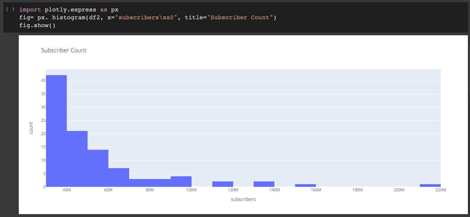
There is so much going on right now in the histogram, so let’s take it step by step.
The first thing we want to do is pay attention to our axes. On the x-axis, we have our variable subscribers. On the y-axis, we have the count of channels with subscribers in that range. In histograms, the bars show us frequency rather than a solid number of things. For our example, we can see a high frequency of YouTubers with between 0 and 40 million subscribers.
Also, a quick shoutout to the channel all the way at the end that made it to 200 million (T-Series). We already know their fan base is grinding.
Plotly Express allows us to create much more customizable histograms by inputting a variety of arguments. Here's a link to histogram documentation for further reference. In this section, we only used the base version with numerical data. But other histograms can also be created using other columns in the YouTube data.
We are going to do the same thing we did before, but this time we will create a pie chart. For this pie chart, we are going to analyze the different video categories and the top channel they belong to.
All we need to do is replace px.histogram(df, x='subscribers') with px.pie(df, values='subscribers', names='category', title='YouTube Categories'):
import plotly.express as px

fig = px.pie(df, values='subscribers', names='category', title='YouTube Categories')
fig.show()
However, this time we need to pass the following arguments to our method call:
values from our data that will represent a portion of the pie chart.names that will represent the names for those regions of the pie chart. For this part, you would need to use a column with numeric values for the values argument and a column with string values for the names variable.title to name the graph. You can choose whatever name you want here, but for the sake of this example, we will call our graph "YouTube Categories".That’s it. All that’s left now is to display the pie chart using the fig.show() method.
You should end up with something like this:
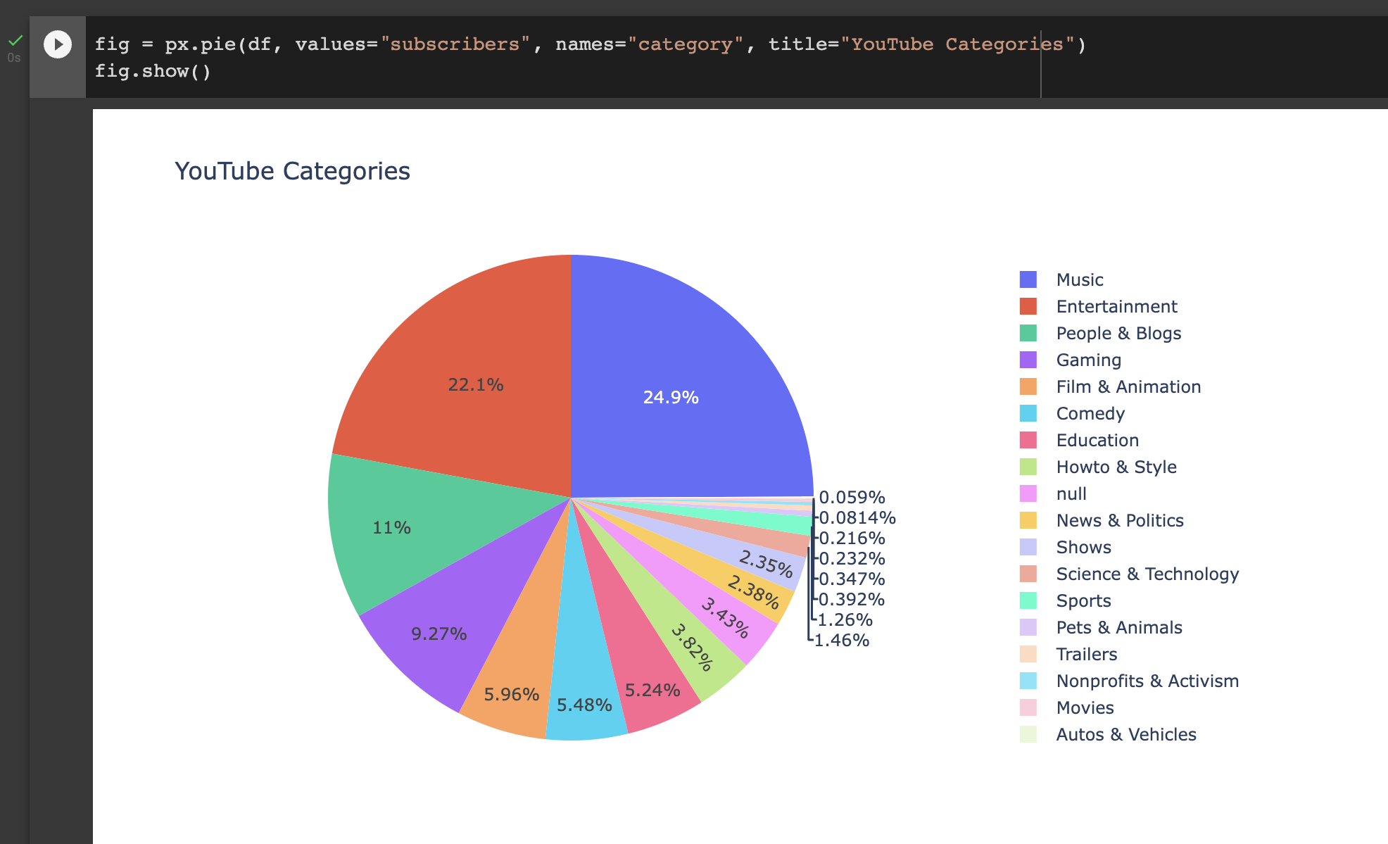
Pie charts are very straightforward to read. The bigger the chunk, the greater quantity we have. We can see here that the top category in our dataset is Music (24.9%). Coming in at number two is Entertainment (22.1%).
Pie chart documentation provides more information about further personalizing the pie charts by changing the colors of sectors and more.
I hope you all aren’t too square to make a box plot. Box plots can show us how spread out our data is. For this example, we are going to use a box plot to analyze the different years people start YouTube.
Sticking to the theme of simplicity, all we have to do to create our box plot is input the following:
import plotly.express as px

fig = px.box(df, y='started', title='Years Started')
fig.show()
The px.box() method follows the convention we have been using in this tutorial:
df.y variable, started.And like before, the graph is complete but isn’t shown on the notebook page. So, to show the graph, we use fig.show() method.
It should look something like this:
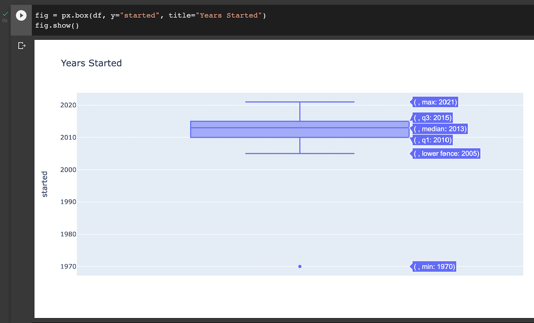
Like that one Tegan and Sara song, let’s get a little bit closer with our graph. In a box plot, we have our minimum value, lower fence, Q1, median, Q3, and maximum value. For this tutorial, we will only be looking at our lower fence, median, and maximum.
Similar to histograms and pie charts, Plotly Express also provides documentation for box plots. By passing point='all' argument to the px.box(), we can also look at all the data points used to make the box plot.
Congrats, you just created three data visualizations analyzing the top dogs on YouTube!
Many people assume data visualization is such a complex thing, but it can be as easy as running a few lines of code. One piece of advice I would give you is to practice using one type of library for your first few months of learning data visualizations. It will give you the opportunity to get the hang of things and learn about your preferences.
Need Help?
Joined 09-07-2022